Datagraphy
A website that I made on Figma that hosts different data visualizations I created.
The Data
I used phone data taken over a week of my friends life. He tracked his phone usage and I compiled it into a single sheet, listed from longest to shortest amount of time. I visualized this data in two ways:
Subway Analysis
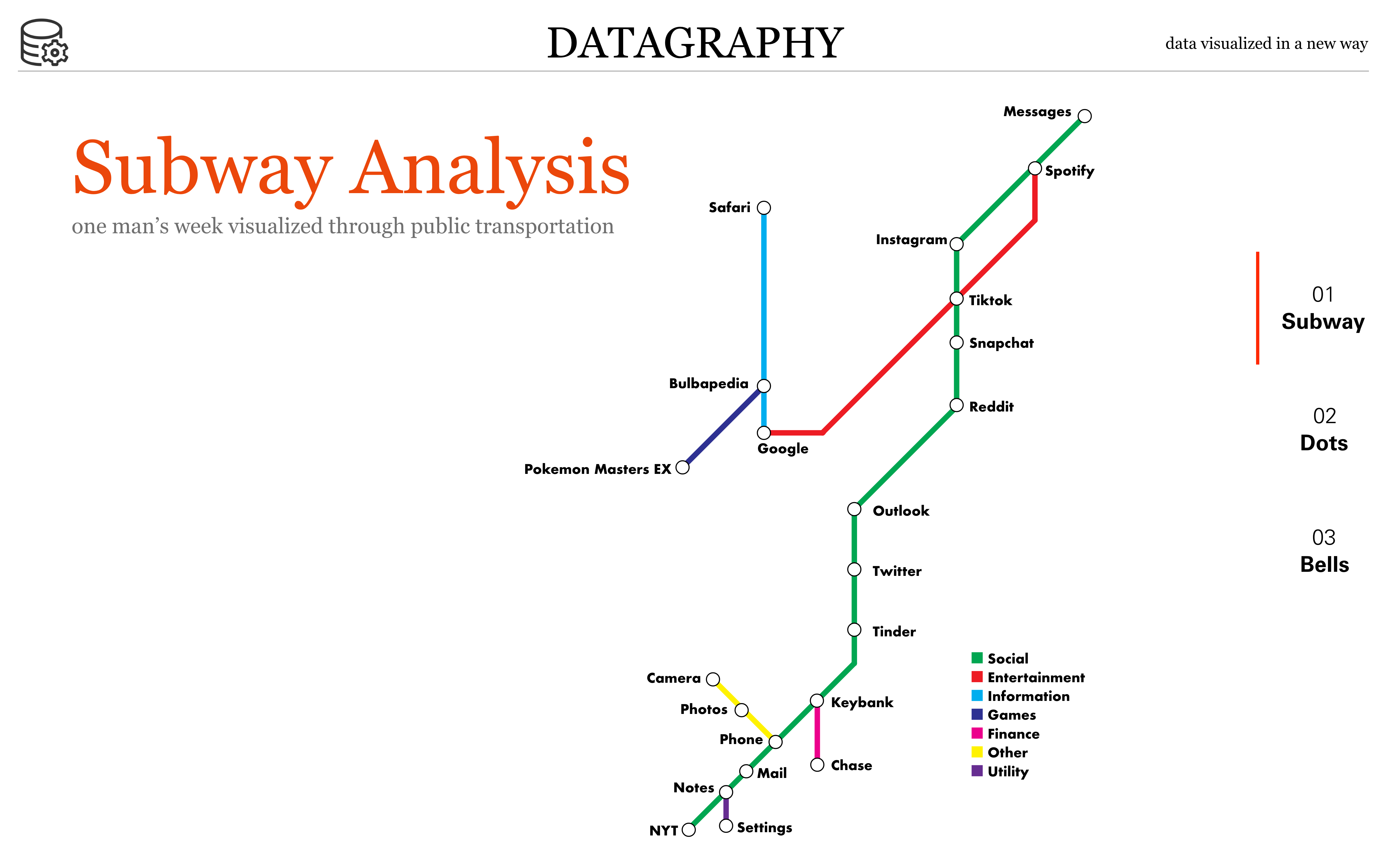
This data visualization is based off of subway maps. The y-axis is based on time, with the most used apps at the top. Each line is a different color and category of app and the stations can have multiple lines going through them if they are in multiple categories. The design was based off of the original London Tube maps that only used 45 degree angles. I wanted to limit myself to create the most visually pleasing effect.
Polka Dot Time
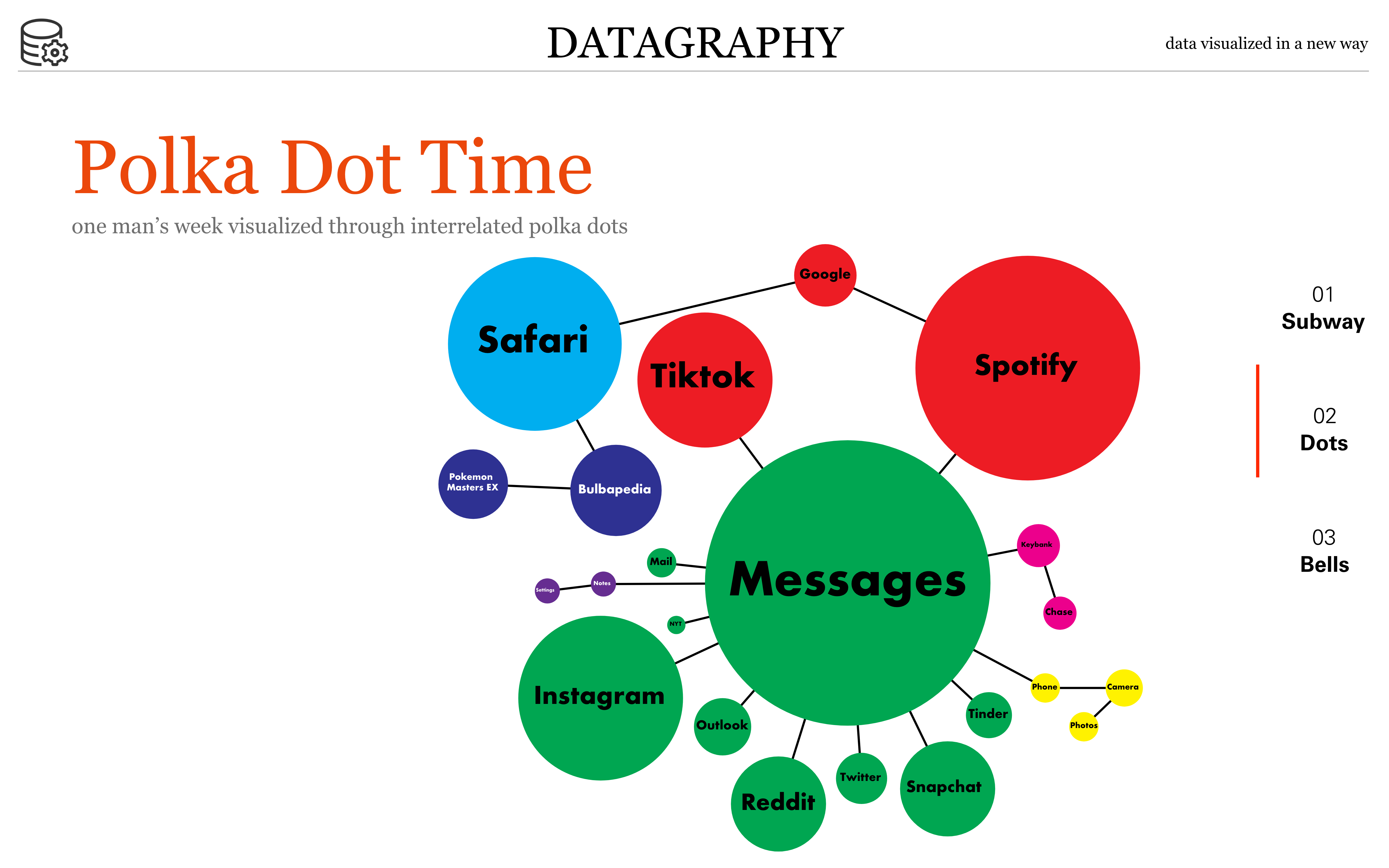
This data visualization is based off of mind maps. Each dot represents a different app and the size corresponds to the time spent on the app. The color represents the category of the map. Dots can be connected to multiple categories, and the biggest dot in the category is the mother dot for all connections. I wanted to create something that was more light hearted and I enjoyed reusing the data and creating multiple visualizations that looked different.
When the Bell Tolls
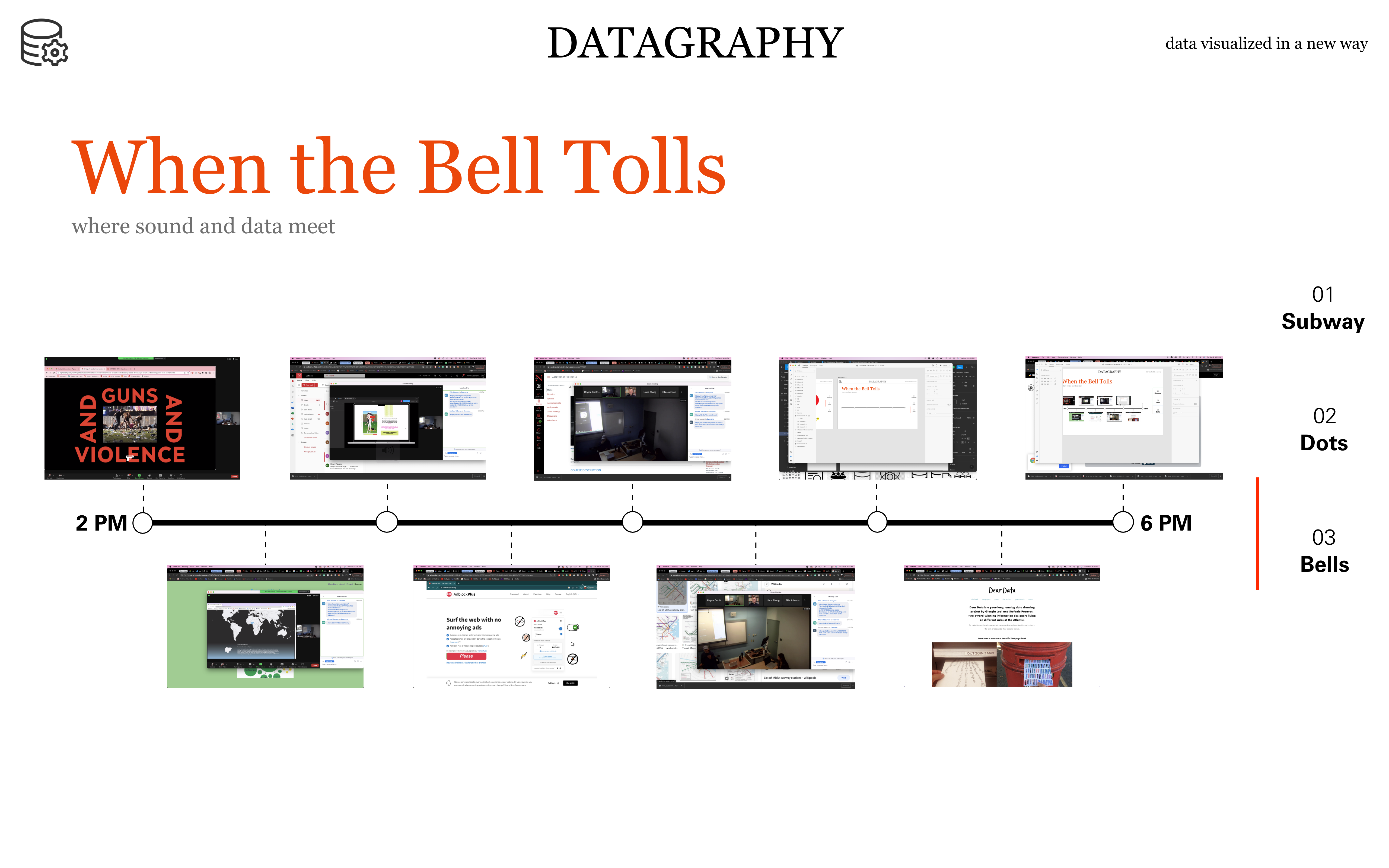
This data visualization is based off of data from my personal life. In my current apartment there is a church that shares an alleyway with my building. Every half hour from 8 am to 9 pm the church rings its bells to mark the time. Every hour it rings its bells the number of hours it currently is. I created a visualization that maps my life to these increments of time. Over a period of time from 2 pm to 6 pm I took a screenshot of computer when the bell rang. I also recorded the sound from my apartment of the bells and any other sounds that were happening at that time. I mapped this images and sounds to a timeline to create a unique visualization of my lived experience.


